Case studies / Case study
Zoom Frame Mode
Keeping chat, audience video, and presenter notes visible during screen sharing, so presenting on Zoom feels collaborative instead of isolating.
- My role
PM, UX Researcher & Designer
- Conducted 2 in-depth user interviews on how people use Zoom compared to other platforms
- Synthesized interview findings with the team into the core insight
- Proposed and designed both lo-fi directions (multi-pane grid and split view)
- Ran usability tests on the lo-fi and hi-fi prototypes
- Timeline
- 12 weeks, Fall 2025
- Team
- 4 people
- Partner
- UC Berkeley School of Information (course project)
- Target users
- Zoom users who share their screen, especially co-presenters in remote collaboration
- Methods
- User interviews (8 total; I conducted 2)
- Sketching and wireframing
- Usability testing: lo-fi prototypes (2 directions)
- Usability testing: hi-fi prototype (2 iterations)
- Deliverables
- Hand sketches
- Lo-fi wireframes (2 directions: multi-pane grid, split view)
- Hi-fi prototype (2 iterations: Single Focus → Double Focus with a layout selector for Single, Double, and Grid views)
- Final report with methodology, findings, and design rationale, presented to stakeholders
The problem
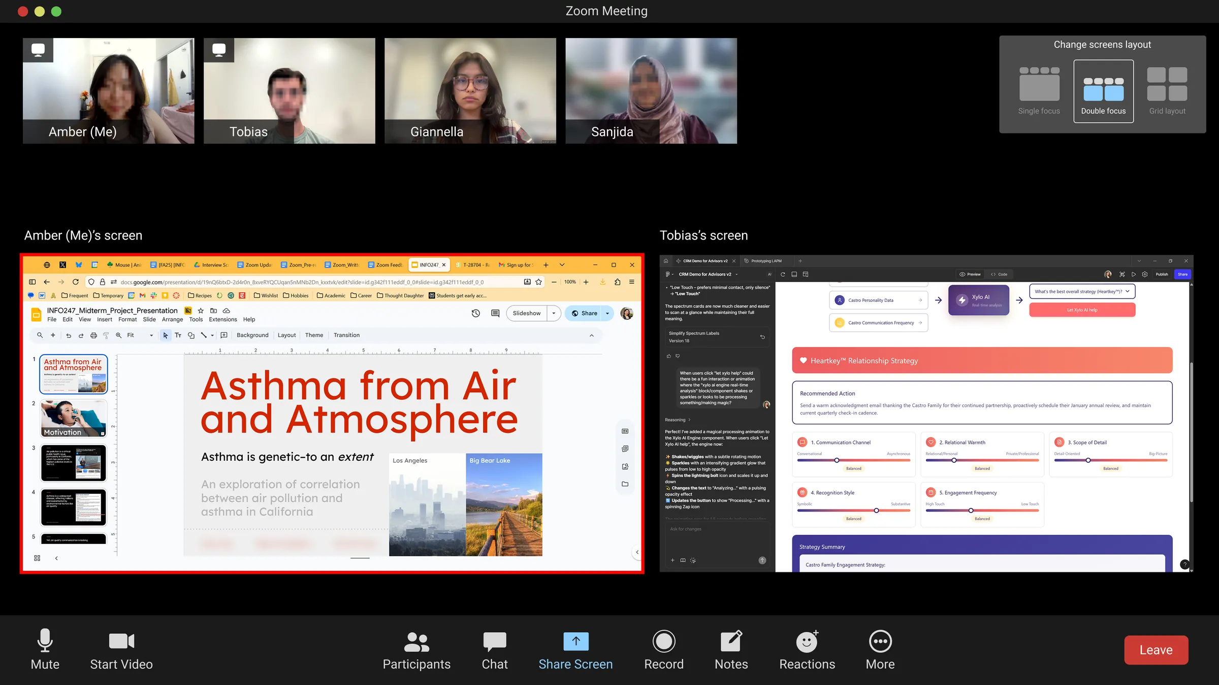
Presenting on Zoom Feels Isolating
People felt frustrated when sharing their screens on Zoom:
- They didn’t know exactly what they were sharing.
- All of Zoom’s icons disappeared.
- When they wanted to share multiple screens at once, people would get kicked off, so there was no seamless collaboration.
Listening
What Presenters Told Us
We went into needfinding to learn what works and what doesn’t on Zoom compared to other platforms, like Discord and Google Meet. Our team ran 8 interviews, and I conducted 2 of them, with graduate students.
Participants were mostly students at Berkeley, UCI, and in Switzerland and Germany, plus a former Product Manager and a manufacturing engineer. Most joined Zoom for lectures, group projects, and interviews, and many preferred Discord, Teams, or Google Meet for everything else.
- Screen sharing is central, but clunky. Choosing what to share was confusing, especially with multiple windows or desktops on a MacBook. One participant had to leave a call to fix macOS permissions. Two participants’ “magic wand” request was simply a clearer screen-sharing selector, and both praised Discord for making it easier.
“Picking which screen to share on my laptop is pretty frustrating, especially since I often have multiple windows open.” (Interview II)
“You really need a second screen to make it work smoothly; otherwise, it’s just chaotic and hard to navigate.” (Interview IV)
- Presenting means juggling too much at once. Most participants were comfortable as listeners, but described presenting and hosting as stressful. One former PM recalled checking the waiting room over and over while presenting:
“It was distracting… someone was left waiting for an hour without being admitted.” (Interview VII)
- Helpful tools stay hidden. Almost no one knew Zoom’s chat, apps, or AI features existed. Whiteboard and annotation tools were “not obvious” and easy to miss, so people stuck to the basics or turned to other tools.
“I didn’t even know it existed, and even if I knew, I wouldn’t use it.” (Interview II, on Zoom’s messaging)
Participants also raised scheduling, calendar integration, account switching, and joining meetings. After the interviews, we decided to focus on presenting, because it was the common theme across what all 8 participants told us.
The turning point
Seeing Everything at Once
So rather than rebuild screen sharing, we designed for visibility: keeping chat, audience video, and presenter notes on screen while someone presents.
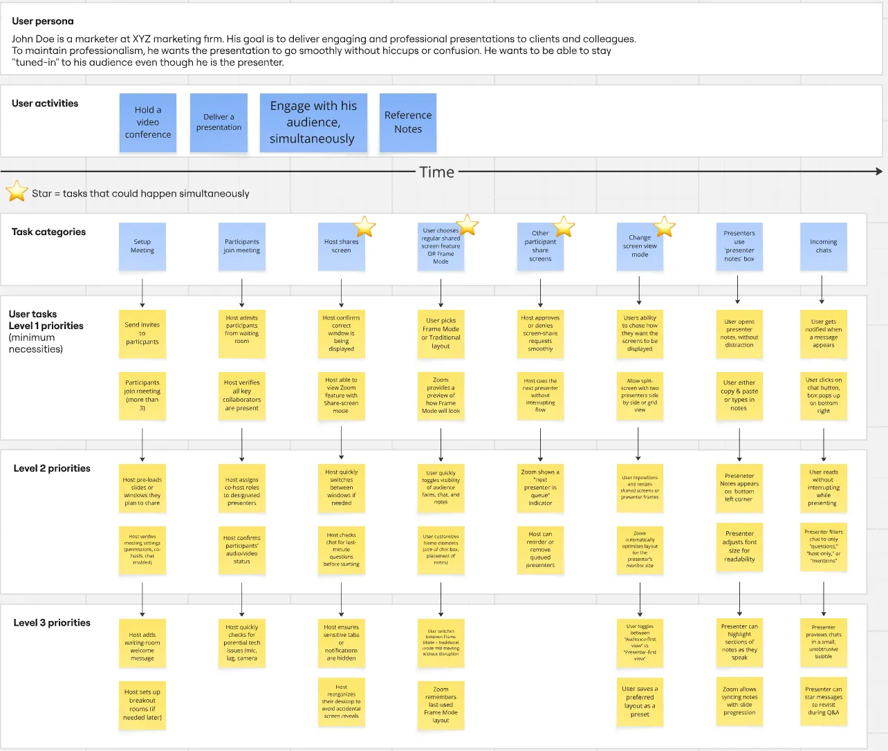
Each round of feedback reshaped the design, across 3 iterations.
What we built
From Sketches to Frame Mode
Lo-fi: Testing “Immersive Share”
I proposed and designed both lo-fi directions: a multi-pane grid and a split view. We tested them with 8 UC Berkeley students under the working name “Immersive Share.”
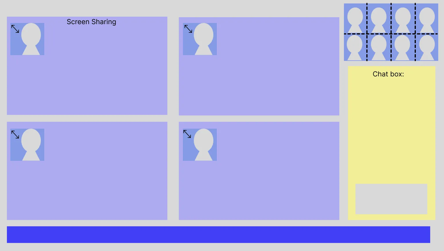
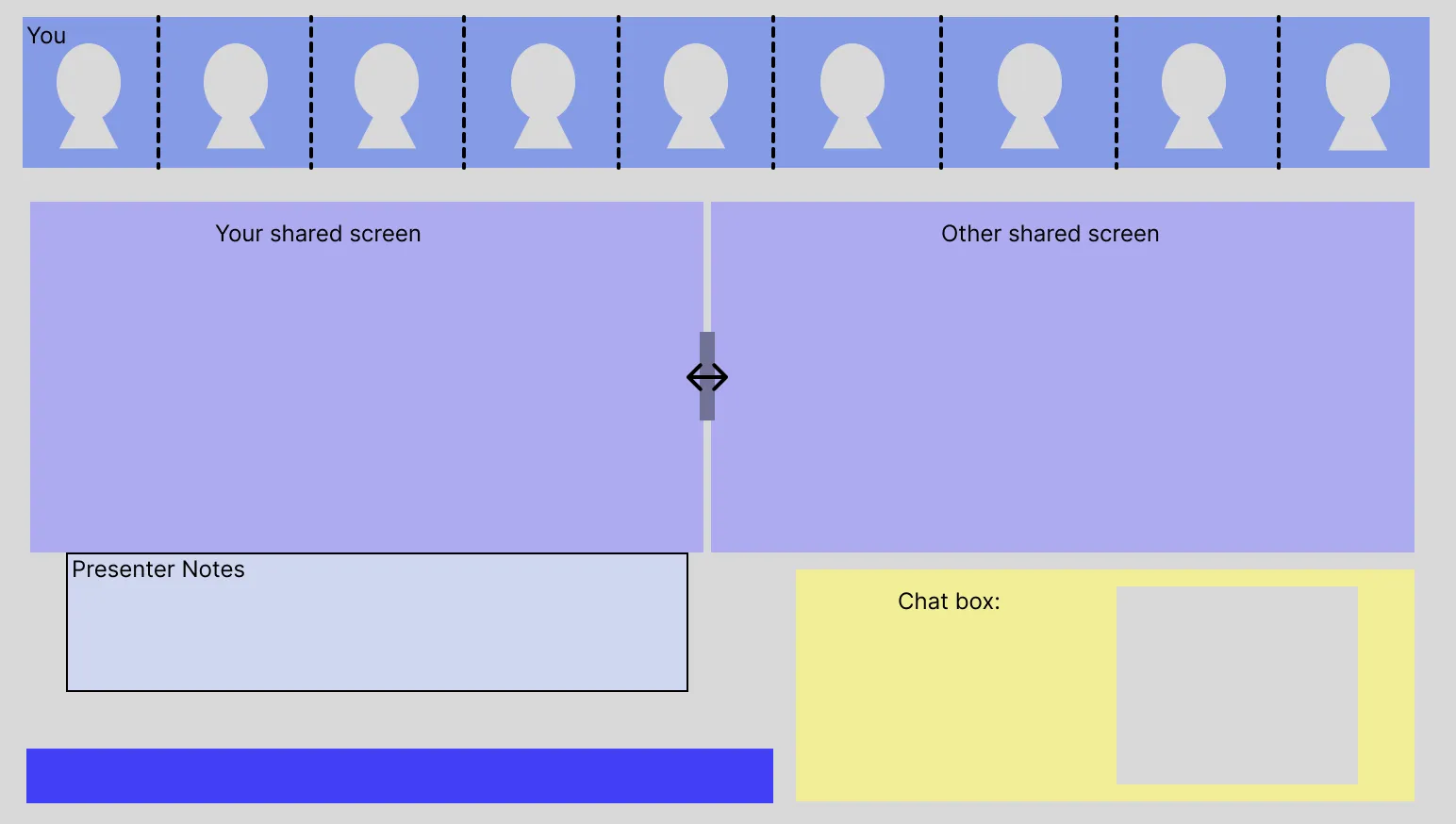
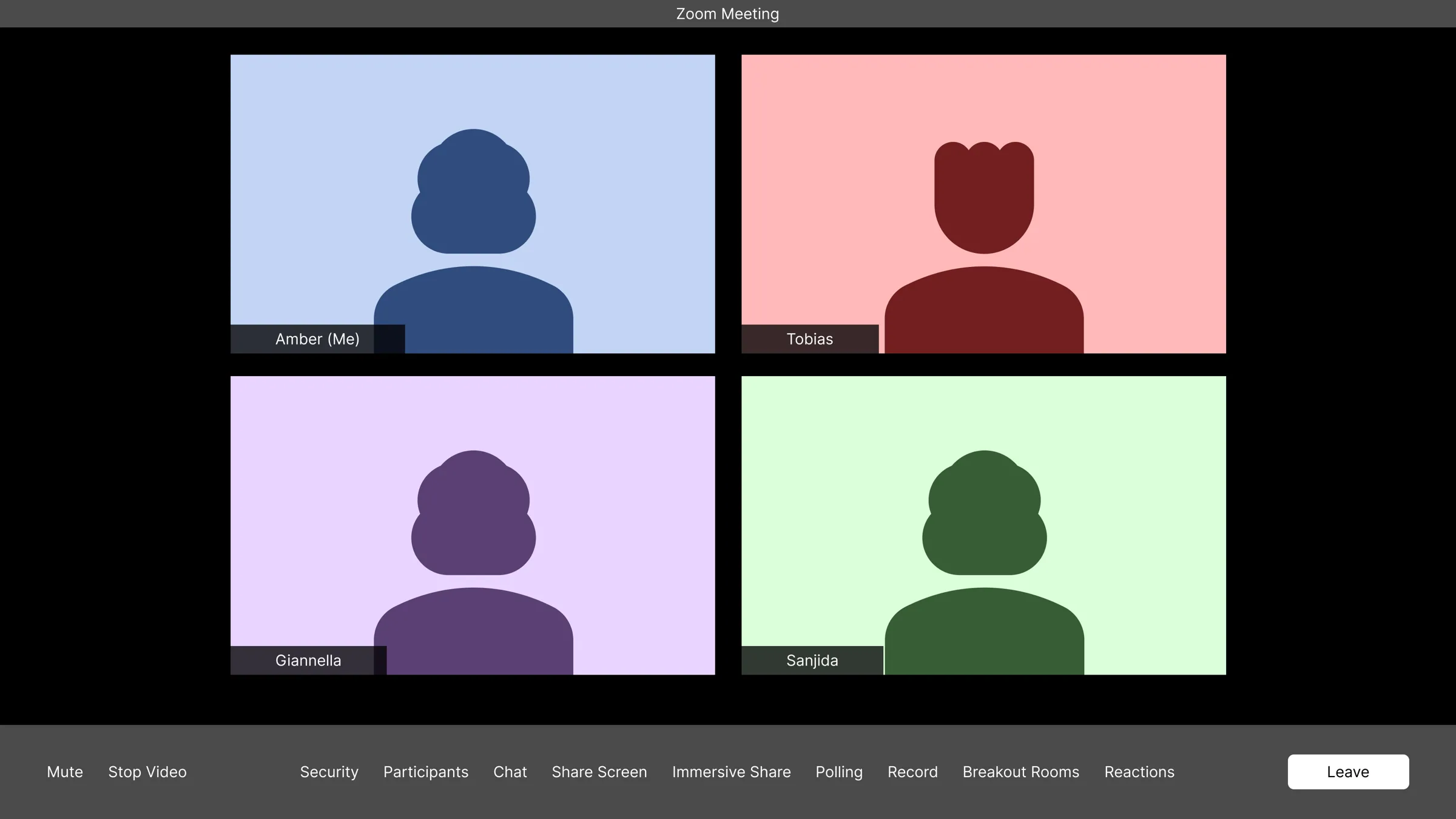
7/8 enjoyed seeing chat and faces while sharing
8/8 said they would use it in their real meetings
≤5s for every participant to find and activate it
What worked:
- Seeing the audience while presenting. Monitoring the audience and chat at the same time was a universal pain point. One participant put it plainly: “You talk for ten minutes and have no clue if people are following.” Immersive Share kept both in view.
- Making multiple sharers visible. None of our participants knew multiple people could share at once. One kept asking “Did you start sharing yet?” even after we had. With our design, the same feature clicked: “[If] I can get a little preview, I can be like, oh, I want to look at this one. Awesome.”
“It feels like sharing, but you’re not hidden behind your slides anymore. Here I still feel like I’m part of the flow.”
What didn’t:
- The name. “Immersive Share” gave the wrong mental model. One participant expected virtual or augmented reality. Having both regular share and Immersive Share on the toolbar was also confusing.
- Density. One participant found it overwhelming: “A lot is happening on one screen.” Another couldn’t tell whose shared screen was whose.
- No presenter notes. One participant printed their notes before every meeting, because they aren’t visible during a standard Zoom screen share. Private presenter notes became part of our hi-fi prototype.
Hi-fi: Testing the Prototype
The hi-fi prototype went through 2 iterations: Single Focus → Double Focus, with a layout selector for Single, Double, and Grid views. We ran 8 sessions of 45 to 55 minutes with college and graduate students, tracking task success, hesitation, and non-verbal cues.
| Task | Completed | What we observed |
|---|---|---|
| Start a presentation using the embedded Zoom browser | 8/8 | 5 of 8 hesitated, with 5 to 10 seconds of think-time. 6 felt anxious at the sign-in page. |
| Open and close chat while presenting | 8/8 | Unanimous 5 out of 5 for ease of use |
| Refer to private presenter notes | 8/8 | Easy to use, but 6 of 8 worried their notes might be visible to the audience |
| Explore multiple shared screens | Mixed | 5/8 found it easier to follow; 3/8 flagged small fonts, unused white space, and unclear icons |
“Much better. With this layout, I would actually check the chat while presenting. Normally, I avoid it because it always messes up my screen.” (Participant 5)
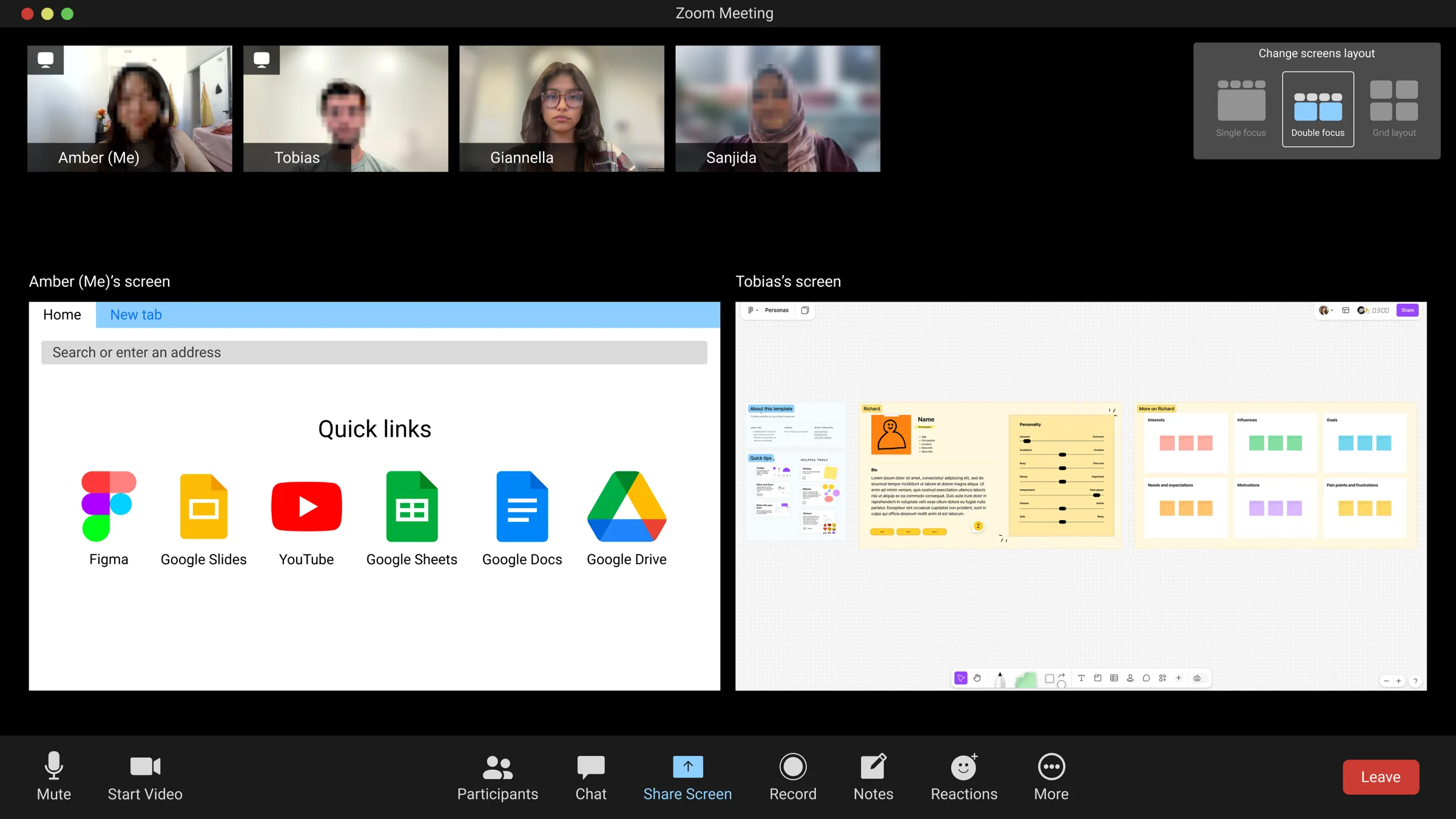
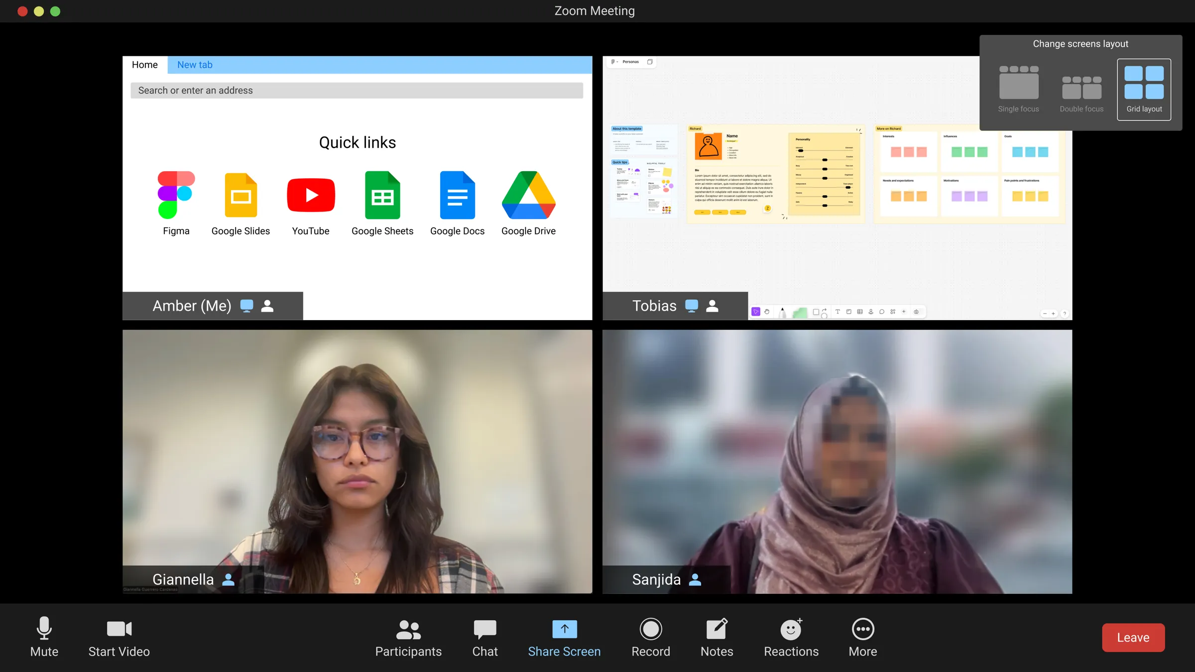
Multi-screen sharing also proved its value. Participants described taking turns sharing as “killing the momentum”:
“We were both trying to show someone designs […] It was just kind of tough […] I share first, […] then I stopped sharing, and then they started sharing […] back and forth.” (Participant 2)
What we recommended next:
- A frame, not a browser. Keep chat, controls, participants, and video visible around the presenter’s own apps and files.
- Better multi-share layouts. Resizing, reordering, and focusing on one screen, with each presenter’s video attached to their shared content.
- Clear privacy cues. A border around shared content and labels like “Private notes - only visible to you.”
- A clear name. Rename the feature “Zoom Frame Mode” and give it a dedicated entry point in the Share Screen menu.
Looking back
What’s Next & What I Learned
What’s Next
- Rename + entry point: Ship final naming (“Zoom Frame Mode”) and update Share Screen UI so it’s easy to discover.
- A/B test privacy and labeling: Run tests on different privacy indicators and labels, measure trust (“How confident are you that your notes are private?”).
- Analytics + success metrics: Track reduced start/stop share events, increased chat engagement while presenting, and satisfaction scores from presenters.
- Stretch: Explore smart defaults (auto-layout suggestion based on the number of presenters).
Reflection: What I Learned
- Names are part of the design. Both “Immersive Share” and “embedded Zoom browser” confused people more than the features did.
- Completion isn’t the whole story. 8/8 finished Task 1, but 5 hesitated. Watching body language caught what success rates missed.
- Ask about real experiences, not hypotheticals. We reworked the interview guide away from “would you” questions, and real stories like “killing the momentum” proved the multi-share need.
- One need at a time. Building a new design that could fit everyone’s needs was challenging, but implementing one idea at a time kept me from bombarding myself with too much at once.
Presenting on Zoom should feel collaborative, not isolating.